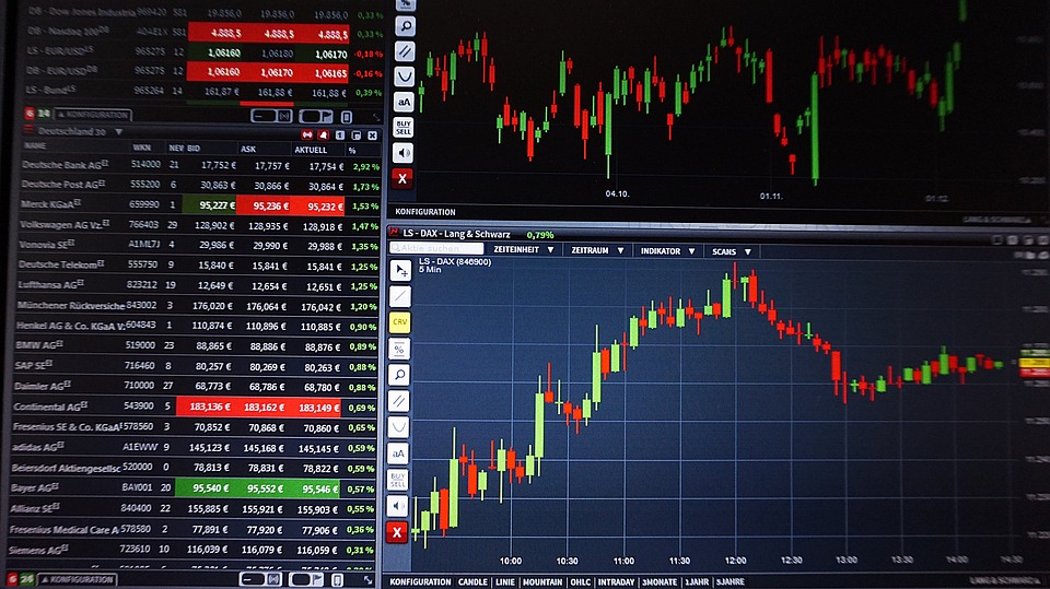
How To” Start Trading The Forex Market? (Part 6)
How To Read Forex Price Charts? Forex Price Charts, what DO they mean and HOW to use them? Important numerous facts as discipline, trading rules, not being greedy etc., but one of the most important things is:

LEARN to read the charts as Charts represent the lifeblood of the market.
I admit that reading charts, and interpreting patterns, are more an art than a skill. Base and apply your entry and exit decisions on YOUR OWN combined methods of technical and fundamental analysis.
FOREX charts, are easier to interpret and to use. They reflect a slower moving, stable economy of a country, compared to the stock market, with its daily drama of company reports, Wall Street Analysts and shareholder demands.
Unlike stocks, currency charts do not spend much time in trading ranges and have the tendency to develop strong trends. Furthermore, Forex with its 4 Mayor currencies is easier to analyze than tens of thousands of stocks.
Mayor currencies are: USD/JPY, EUR/USD, GBP/USD and USD/CHF
The complimentary FREE live charting software, with the ultimate cutting edge technology provided by http://www.fenixcapitalmanagement.com/, will be absolutely sufficient for you to analyze and watch any one currency pair. Understanding just a few basic points about the technical analysis of currency chart can lead to increased profit potential.
Pricing – Price reflects the perceptions and action taken by the market participants. It is the dealing between buyers and sellers in the Over-The-Counter (OTC) or “interbank” market that creates price movement. Therefore, all fundamental factors are quickly discounted in price. By studying the price charts, you are indirectly seeing the fundamental and market psychology all at once , after all the market is fed by two emotions – Greed and Fear – and once you understand that, then you begin to understand the psychology of the market and how it relates to the chart patterns.
Data Window Chart – FCM and most online charting stations, when you click on a price bar or candlestick, it will display a small box of data usually called a display window which will contain the following items:
- H = Highest Price
- L = Lowest Price
- = Opening Price
- C = Close Price (or Last Price)
The most common types of price bars, used in FOREX trading, are the Bar Chart and the Candlestick chart:
Bars Charts
Price bars are a linear representation (a line) of a period of time. This enables the viewer to see a graphic representation summarizing the activity of a specific time frame. As an example, I use 10 minutes, 60 minutes and daily time interval for my systems. Each bar has similar characteristics and tells the viewer several important pieces of information.
First, the highest point of the bar represents the highest price that was achieved during that time period. The lowest point of the bar represents the lowest price during the same period. Regular bars display a small dot on the left side of the bar which represents the opening price of the period and the small dot on the right side represents the closing price of the period.
Candlesticks – Japanese Candlesticks, or simply Candlesticks as they are now known, are used to represent the same information as Price bars. The only difference is that the difference between the open and close form the body of a box which is displayed with a color inside. A red color means that the close was lower than the open, and the blue color represents that the close was higher than the open.
If the box has a line going up from the box it represents the high and is called the wick. If the box has a line going down from the box, it represents the low and is called the tail.
Many interpretations can be made from these “candlesticks” and many books have been written on the art of interpreting these bars.
Chart Intervals & Time Frames:
A chart Time Scale & Period, or time frame, basically refers to the duration of time that passes between the OPEN and the CLOSE of a bar or candlestick.
For instance, with your broker software, you will be able to view a currency pair, in a 1-hour time frame over a 2-day period, 5-day period, 10-day period, 20-day period and 30- day period.
Most of the short-term time intervals (5-min and 1-min charts) are used for entry and exit points and the longer- term time intervals (1-hour and daily charts) are used to see where the general trend is.
By Martin Maier


![Le chocolatier suisse Läderach développe une histoire d’amour avec la Chine [ INTERVIEW ]](https://www.afrique-54.com/wp-content/uploads/2023/12/Johannes-Laderach-et-chocolat-e1702548585357-218x150.jpg)


